Verizon Banner Ads Design System
Verizon’s banner ads are crucial entry points for millions of potential customers. When tasked with updating them to match the redesigned website, we constructed a comprehensive design system that defined the appearance and standardized the production process. As the project’s designer, I established rules and rigorously stress tested them against real-world scenarios to ensure seamless integration.
Foundations
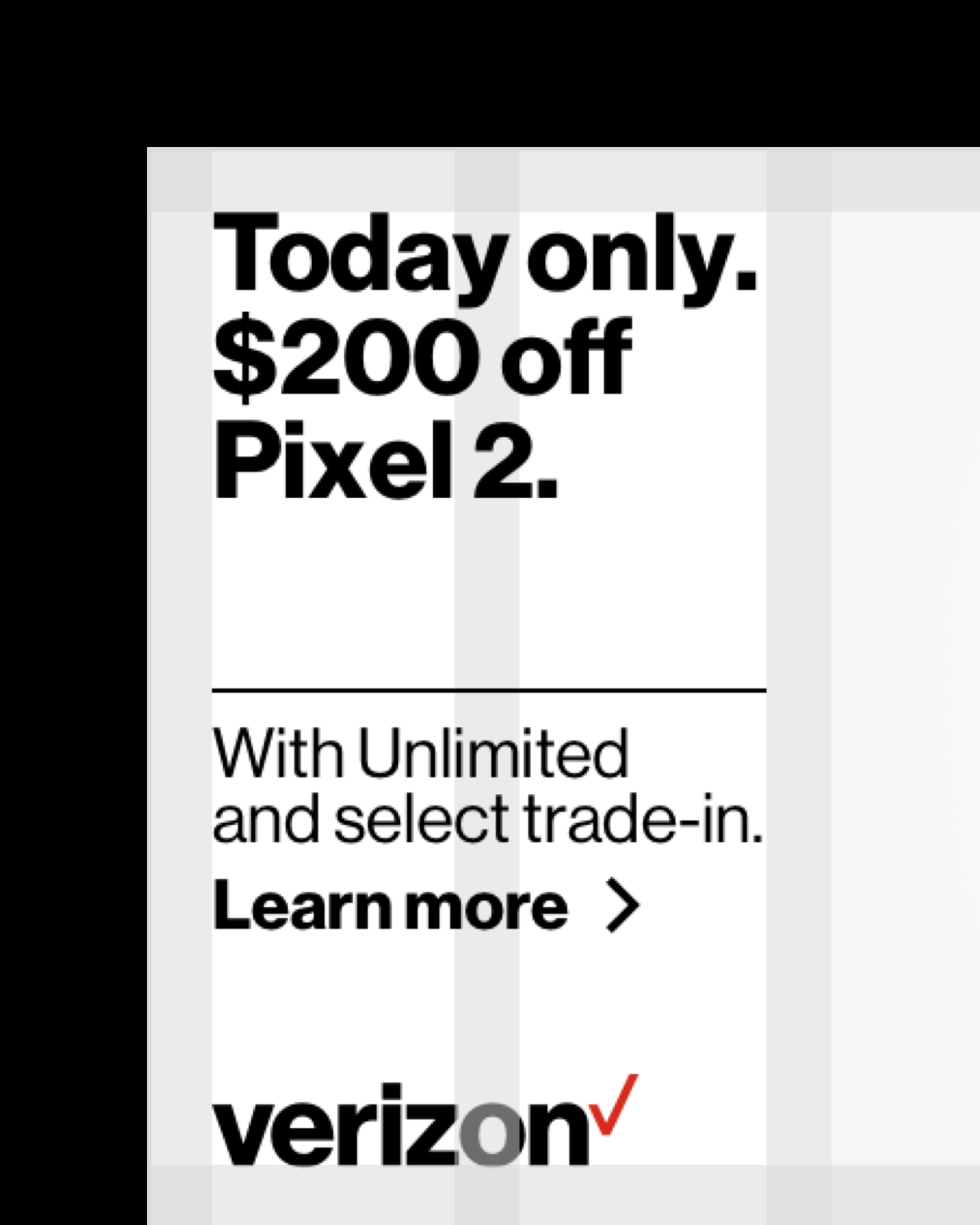
I started by creating five banners on a grid system, mirroring the website’s layout and incorporating the same visual elements of divider lines and image panels. To ensure consistency and cohesion across various sizes, I devised guidelines for everything like typography, positioning, and even spacing around device imagery.


Stress Testing
Next, I subjected the design to stress tests under various usage scenarios, revisiting and refining the rules whenever the system encountered issues. Through this iterative process, I developed a standardized treatment capable of adapting to different copy lengths and device lockups, alongside a lifestyle treatment for full bleed imagery, and a contingency treatment for instances where animation isn’t available.


Templates
Once the rules were approved, I aggregated them into a set of templates. They are currently being used by creatives across the team as an easy way to follow the design system.

