SIMON Markets is a fintech company building a global marketplace for financial advisors to access alternative investments.
SIMON Markets Design System
Throughout my design career, I’ve established a reputation for setting high standards and elevating design quality. This commitment to craft excellence proved instrumental when I joined SIMON Markets, a fast-growing fintech startup which lacked a centralized design language. Recognizing the potential to streamline the design process, I seized the opportunity to build the company’s first-ever design system. I worked on this initiative on top of my regular product team responsibilities.
Foundations
Color
The team relied on a limited color palette that lacked derivative shades. As a result, designers were forced to manually mix new colors each time a darker or lighter tone was required for backgrounds, buttons, hover effects, etc. This was a time-consuming process that led to inconsistencies and a growing burden of design debt across the platform.

Creating the Expanded Palette
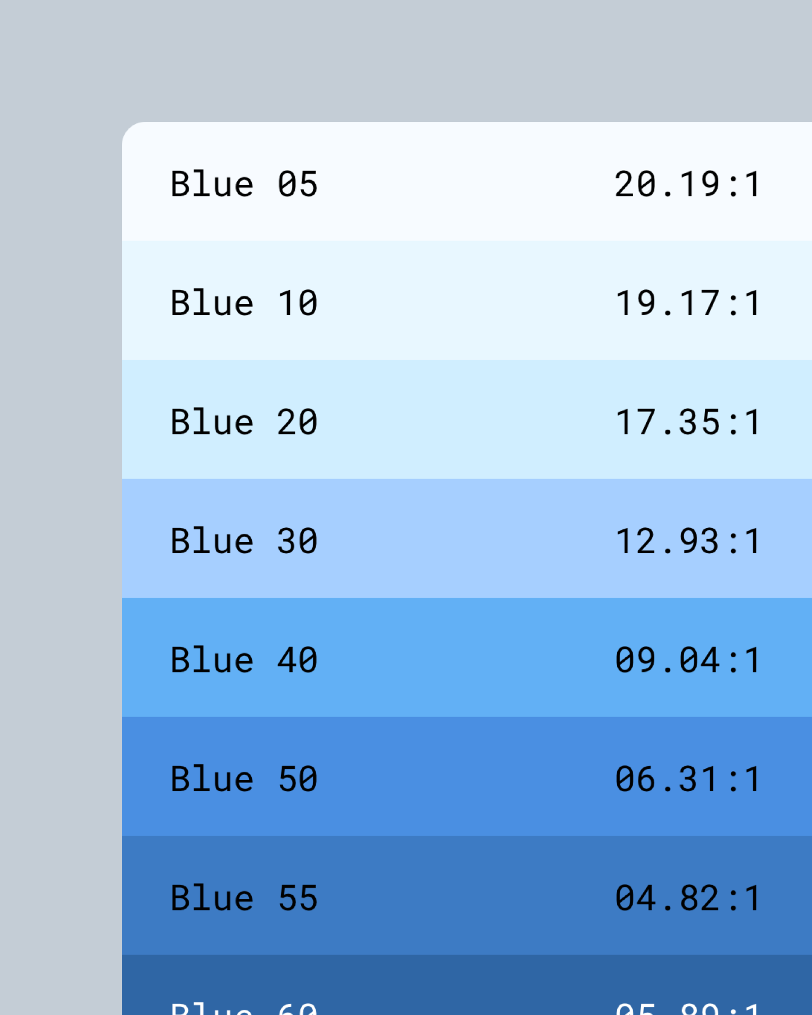
To address this gap, I implemented a systemic and data-driven approach to build a comprehensive color palette. First, I calculated the contrast ratio of each existing color against black or white. Next, I mapped the values to a established contrast ratio benchmark. Using the original colors and their position on the benchmark as a starting point, I created the lighter and darker shades by aligning to the contrast ratios for the rest of ramp.
This method ensured colors at the same level (e.g. all color with 20 in their name) across different ramps share similar luminosity, promoting visual harmony. A desaturated version of the palette clearly demonstrates this consistency. Furthermore, it simplified accessibility compliance - I used the Stark plugin to determine the optimal text color (dark or white) for each shade, ensuring adherence to accessibility standards.
Dealing with the blue presented a particular challenge. The original set offered three shades so a strict adherence to the defined method would’ve resulted in an overwhelming 30 variations of blue. However, I wasn’t aiming to alter the core brand colors. To navigate this, I mapped the existing three blues to the contrast benchmark and meticulously blended intermediate colors to create a single ramp that perfectly fit our design needs while avoiding excessive complexity.


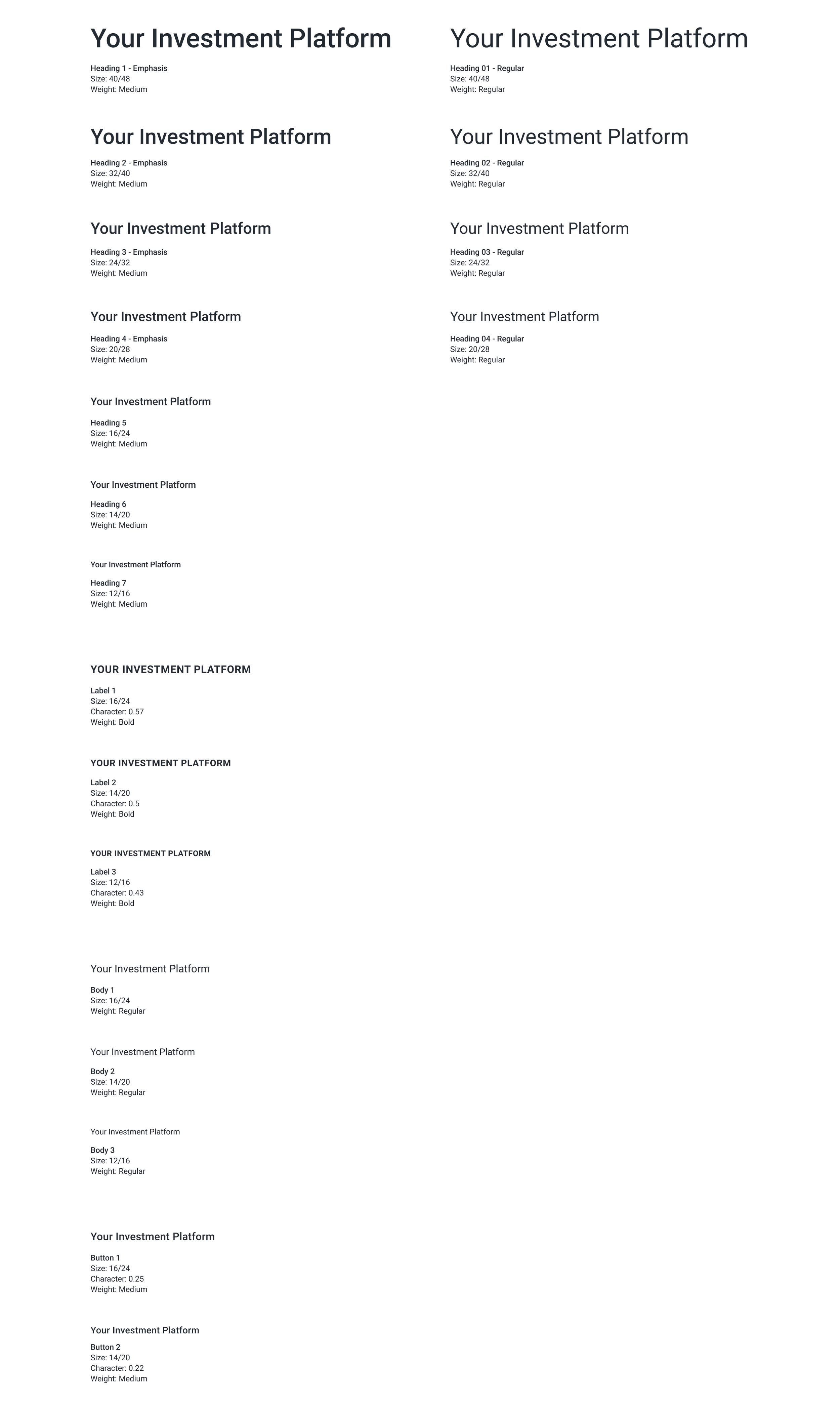
Typography
To establish the typography system, I audited the existing platform to identify the most commonly used font size and weights. Following the principles of the 4-point grid system, I set line heights as multiples of 4, ensuring optimal visual rhythm.
Color Tokens
Establishing color and typography was a crucial first step but it didn’t end there. As I delved into designing individual components, I revisited and refined these foundations to ensure they effectively addressed real-world use cases. This ongoing interplay between core principles and component design informed the establishment of color tokens.

Components
To build a robust library, I looked at various best-in-class design systems and created a list of components we needed for our own. I then tackled each component one by one, starting with an initial audit to understand current usage patterns before standardizing and defining all necessary variations and states.
Prioritizing both usability and maintainability, I invested significant time building the components within Figma/Sketch. I meticulously crafted each component in a way that ensures a smooth user experience for everyday designers with intuitive property panel controls while also facilitating efficient future maintenance by leveraging my design program expertise to simplify component construction.
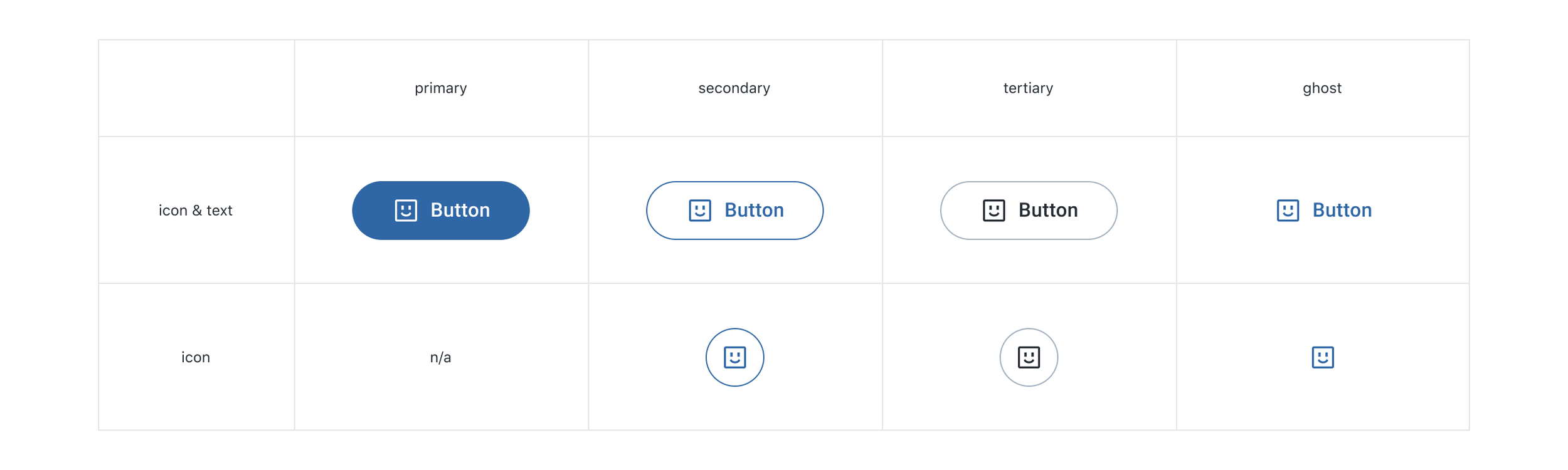
Button
Primary - Brings attention to the main action on the page. Limit one per page or container.
Secondary - For the actions on the page or container that don’t need to be as prominent as the primary action. Can display multiple secondary buttons in a row.
Tertiary - For even less prominent actions on the page or container. Can display multiple tertiary buttons in a row.
Ghost - For the least prominent actions on the page or container. Can display multiple ghost buttons in a row.


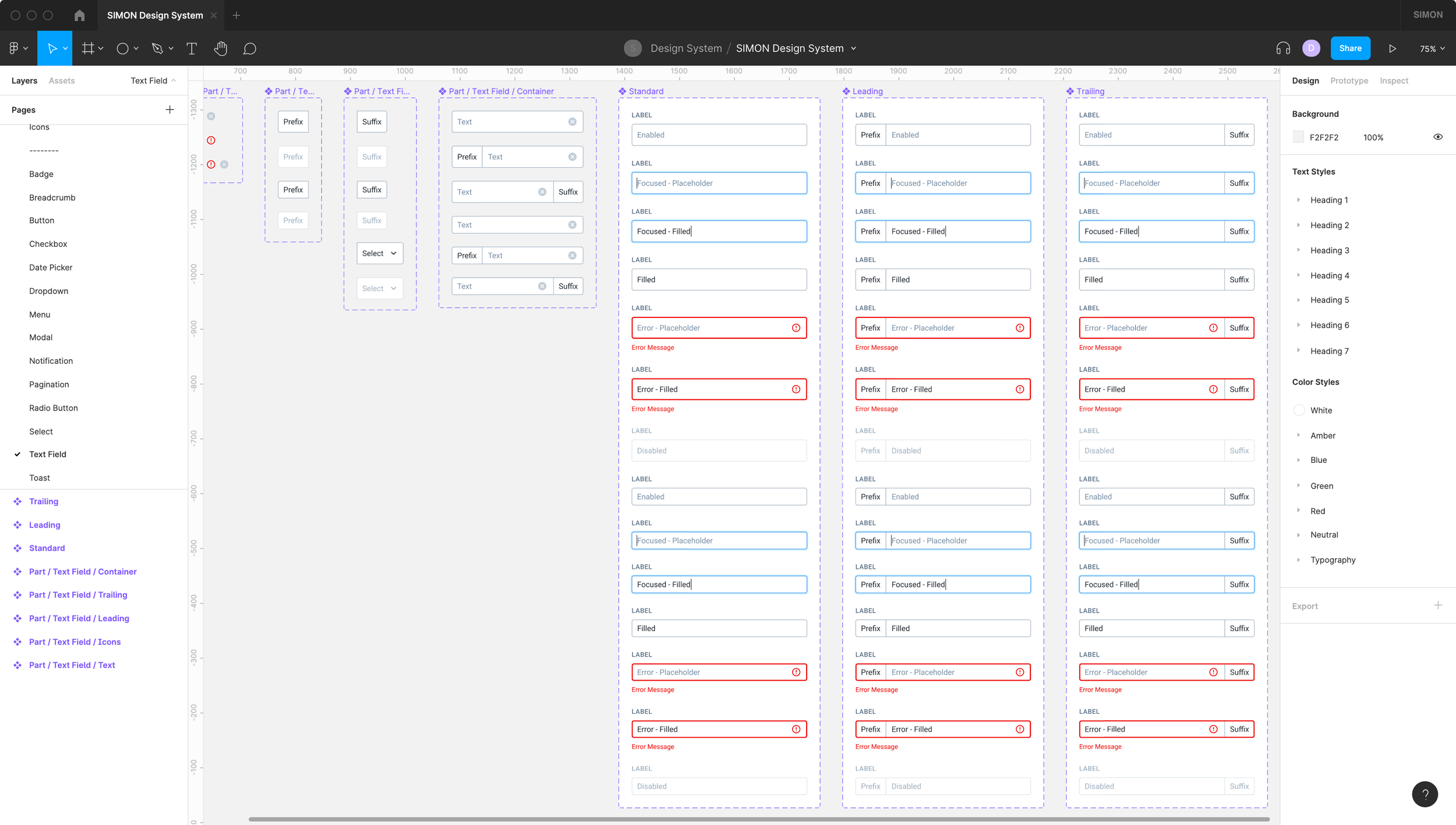
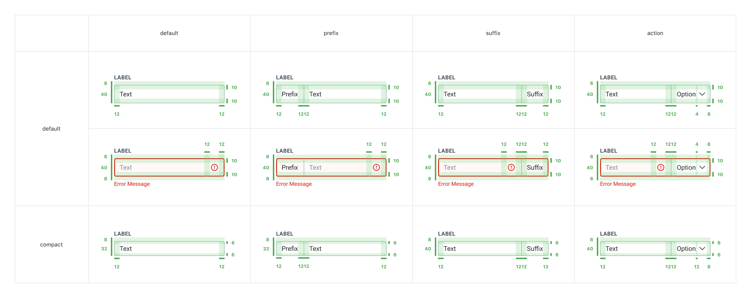
Input Field
Text - Allows the user to enter and edit text.
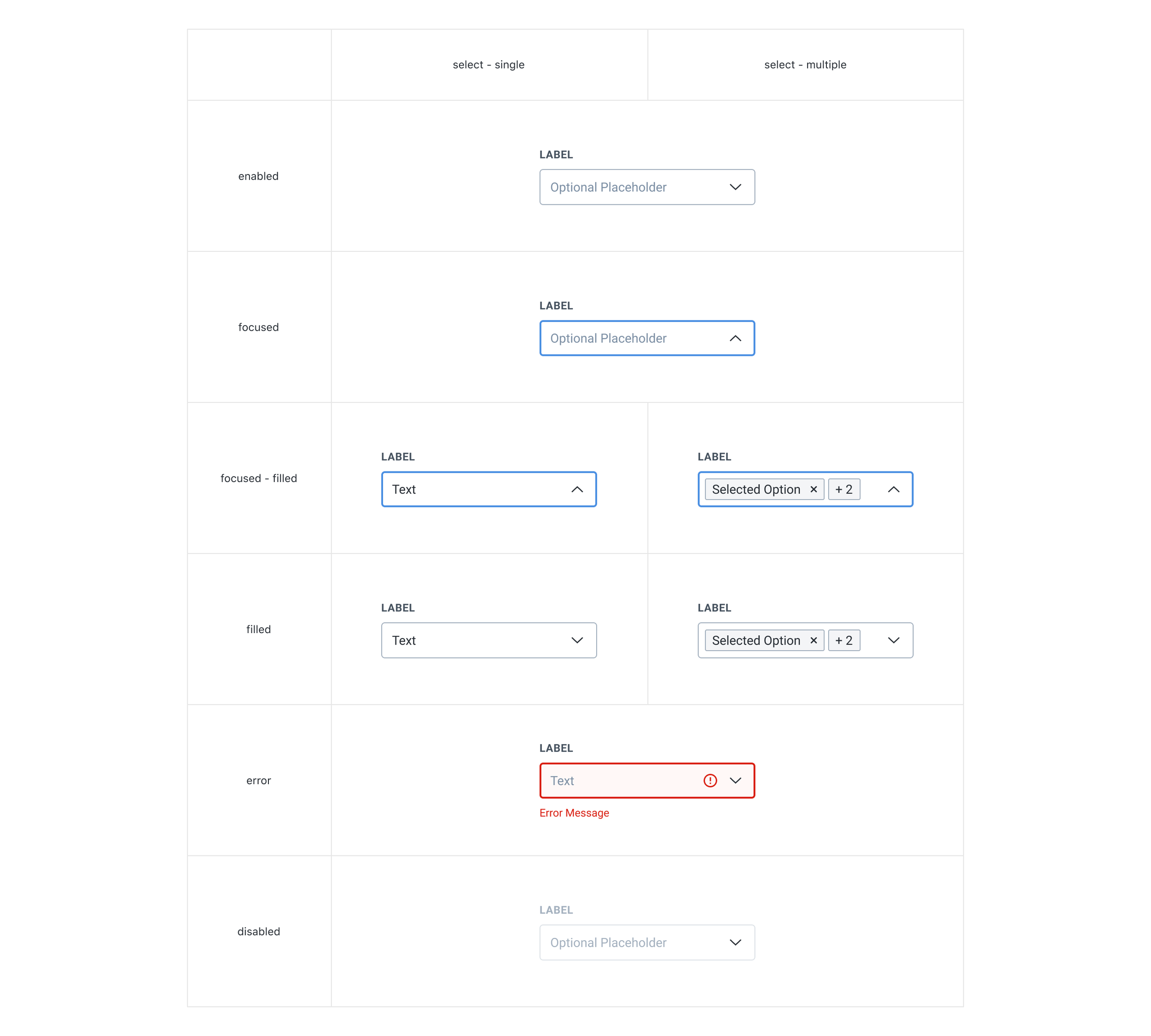
Select - Allows the user to select one or more options from a menu that is opened by clicking on the input field.


Menu

Control
Checkbox - Allows the user to make as many selections as they want.
Radio Button - Allows the user to make one selection from a group of options.
Switch - Allows the user to quickly toggle between on and off states.
